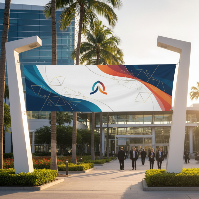
How to Design the Perfect Conference Banner for Your Event?
Designing the perfect Conference Banner is essential for any event. A well-crafted banner can significantly enhance your event’s visibility. It serves not just as decor, but as a vital communication tool. A conference banner should reflect your brand's identity and engage attendees effectively.
Consider the visual elements carefully. Colors, fonts, and images must align with your theme. A cluttered design can confuse onlookers. Space is important; leave room for key details. Make sure your message stands out clearly.
It's crucial to evaluate your choices critically. Sometimes what looks good may not work in practice. Test different designs with your target audience. Their feedback can provide insights you might overlook. Remember, the perfect conference banner is a blend of creativity and strategic thinking, so iterate until you find the right balance.
Understanding the Importance of a Conference Banner in Event Marketing
A conference banner serves as a powerful tool in event marketing, bridging the gap between your message and your audience. It draws attention and sets the tone of your event. A well-designed banner can elevate perceptions of your brand. Conversely, a poorly executed banner can lead to misunderstandings. Think about the key elements: clear messaging, appealing visuals, and strategic placement. These factors not only enhance visibility but also convey professionalism.
Consider the importance of color and typography. Bright colors can attract eyes, while legible fonts ensure easy reading from a distance. However, overcrowding with information can dilute your message. Simplicity often holds more impact. Reflecting on your design choices is crucial. Are they resonating with your target audience? Are they aligned with the event’s theme? Engaging visuals should complement, not overshadow, your content.
Ultimately, a conference banner can shape attendee perceptions even before they enter the venue. It’s often the first impression, making it vital to get it right. Crafting a memorable banner requires introspection and attention to detail. Consider what works and what doesn’t. Your banner should be a conversation starter, not just decorative. Even minor tweaks can lead to significant improvements in how your event is perceived.
Key Elements of Effective Banner Design: Size, Shape, and Material
When designing a conference banner, the size is critical. A banner that is too small will blend into the background, failing to capture attention. Ideally, the height should be noticeable, while the width allows for clear visibility from a distance. Consider the venue’s dimensions and the viewing angle. A larger banner might be necessary for open spaces, while smaller venues may require compact designs.
Shape plays a vital role in banner effectiveness. Rectangular banners are standard, but other shapes can stand out. Vertical designs can draw the eye upward. Circular formats may attract curiosity, inviting closer inspection. Ensure that the shape aligns with your message. Unique shapes can be more memorable, but they can also complicate design.
Material is equally important. Lightweight materials are easier to transport but may lack durability. Heavy-duty vinyl or fabric ensures longevity but could increase costs. Reflect on your event’s location and duration when choosing materials. Weather conditions can impact outdoor events. A waterproof option can be beneficial. Always prioritize vibrant colors and readable fonts for clarity. Balancing eye-catching elements with professional aesthetics can be challenging. Strive for a cohesive look without overloading the design.
Effective Banner Design Dimensions
Best Practices for Visual Hierarchy and Branding in Banner Layout
Effective conference banner design begins with a clear visual hierarchy. This guides attendees' eyes and focuses their attention. A recent study found that 67% of viewers remember visuals better than text. Ensure your key message stands out. Use large, bold fonts for headlines, and limit the number of words to enhance clarity.
Branding plays a critical role in banner layout. Consistent use of colors and logos fosters recognition. Approximately 85% of consumers make purchase decisions based on color alone. Select a color palette that reflects your brand identity. However, be cautious of overcrowding your banner. Too many elements can overwhelm viewers.
Reflect on your design choices. Are they engaging or confusing? Simplicity often yields better results. A survey revealed that 60% of banners fail to attract attention due to clutter. Regular assessment of your designs can improve their effectiveness. Update designs based on feedback and evolving trends.
Incorporating Data and Metrics for Impactful Conference Messaging
When designing a conference banner, data and metrics play a crucial role. They provide evidence that can make your messaging more impactful. Start by identifying key statistics relevant to your event. For instance, if your conference focuses on sustainability, include data on climate change impacts. Effective visuals can translate numbers into compelling graphics. A striking infographic will catch the eye and convey your message quickly.
Incorporating metrics isn’t just about numbers; it’s about storytelling. Highlight successes from past events, like attendance growth or audience engagement rates. Use these metrics to create a narrative. Displaying achievement in a prominent way helps establish credibility. However, don’t overwhelm your audience. Too much data can lead to confusion or disinterest.
Reflect on how you present this information. The balance between visuals and text is critical. An overcrowded banner can detract from your main message. Aim for clarity and digestibility in your design. This approach can elevate the effectiveness of your conference banner significantly, ensuring that your audience absorbs and remembers your core message.
Essential Design Tools and Resources for Creating Professional Banners
When designing a conference banner, the right tools can make a significant difference. Software like Canva and Adobe Spark offers user-friendly interfaces. They provide templates tailored for events, which simplifies the creation process. Using these tools, you can customize fonts, colors, and images to align with your branding. However, it’s essential to avoid overcrowding your banner with text and images. Simplicity often yields a more professional result.
In addition to digital platforms, consider resources like stock photo websites. High-quality images enhance visual appeal and clarity. Choose photos that relate directly to your event's theme. Moreover, pay attention to typography. The right font can convey your message effectively, but readability is crucial. Testing your design on different screen sizes can reveal potential flaws. Make adjustments based on feedback from peers; their perspectives can identify areas you might overlook.
While tools and templates can guide your design, creativity is key. A unique approach will capture attention. Reflect on your preferences and the message you want to convey. Don't hesitate to experiment. Understand that the design process involves trial and error. Embrace imperfections as opportunities to craft a better representation of your event. Design is as much about learning as it is about execution.